

CONSUMER PSYCHOLOGY
COLOUR POWER IN BRANDING
Manilka Ediriweera explores the psychological prism on the use of colour
Colour is influential and effective as a marketing and branding tool; and it says a lot about human nature too. It can reinforce brand attributes, and create consistent recognition and memorability, as well as evoke emotions and influence behaviour.
 However, colours can’t be universally translated into specific feelings in humans because each of us perceives colour based on distinct factors such as individual experiences, upbringing and cultural differences.
Even though colours may signify different things to different people, humans have been hardwired to respond to them – and this makes it an effective way of conveying information.
The psychology of colour can be defined as the science of how hues and shades affect our behaviour and perceptions. Although there’s a good deal of conversation surrounding the topic of colour psychology, this is a controversial aspect of marketing because it’s not backed by sufficient evidence.
A 2006 study by the University of Winnipeg titled The Impact of Colour on Marketing reveals that around 90 percent of people make snap judgements about products based on colour alone. Therefore, since the use of colours can influence how people make decisions, this field of study is essential in marketing and branding.
Iconic brands such as Coca-Cola, McDonald’s, Ferrari, Facebook, Tiffany & Co. and Android among others have mastered the use of colour. Their logos are instantly recognisable and play a vital role in establishing brand identity by communicating the desired image.
There are some widely used colours in marketing and branding across industries.
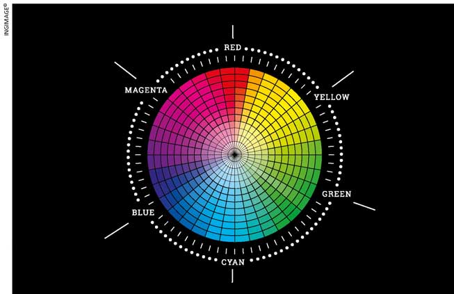
Blue is associated with trust, loyalty, confidence, reliability, intelligence and integrity. It’s used by companies such as Samsung, Nokia, Intel, Dell and IBM.
Red is resonant with desire, passion, courage, power and determination; it is used by organisations such as Netflix, Target, YouTube and Adobe.
Green denotes growth, environment, nature, peace and optimism; it’s used by the likes of Starbucks, The Body Shop and Land Rover.
Orange is often linked to energy, drive, vitality, force and productivity; brands that use it include Harley-Davidson and Nickelodeon.
Yellow expresses positivity, cheerfulness, joy, happiness and caution. It’s used by brands such as National Geographic, IKEA and Ferrari.
The application of colour in creating brand identity is of immense importance especially in the digital age we live in. Corporates are extremely particular when it comes to choosing colours, and are looking for the best ways to use them in their logos, products, product packaging, websites and merchandise. This is because the colours associated with a brand can provide consumers with information on its personality at a glance and elicit an emotional response. But as you create your brand identity, you may encounter questions such as what colour best suits the brand; or how you use colour in marketing and branding; or how you use it to provoke emotional responses among your customers.
It’s crucial to understand that there are no clear-cut guidelines about the use or selection of colours. However, what you can do is to identify your brand personality first. Based on this, you may select a colour that best expresses your brand.
Ever heard of the expression ‘stand out like a sore thumb’ or the psychological principle referred to as the ‘isolation effect’?
It states that the more you stand out, the more noticeable you will be, which eventually increases the likelihood of your brand making the grade. So selecting the right colour at the beginning and sticking to one throughout will help your brand to stand out in the end.
Even with the success of a webpage, it’s safe to consider colour psychology as a potent web designing tool, which influences conversion rate optimisation. Brands must ensure they use the same colours they’re associated with on their website.
Because consistency is crucial, the colours used should remain unchanged throughout. Not only should the selected colours be incorporated into your logo and website but also in all marketing assets, social media profiles and even email signatures. This is because colour exerts an extensive influence over human behaviour and emotions.
Although there is no guarantee that using a specific colour will make your brand strategy more successful, there are strong parallels between brand perception and colour.
The examples above demonstrate how colour is an essential element of an organisation’s brand identity. Mastering the use of colour in building your brand identity can be a tricky and gruelling task; but if used properly, at the right time with the target audience for the desired purpose, your marketing and brand strategy will be a success.

