IN CONVERSATION WITH AN ‘ART-CHITECT’
THE ART OF SPATIAL STORYTELLING IN MODERN SPACES
BY Tameez Bohoran
 Charith Wijesundara is no stranger to the art and architecture community in Sri Lanka. From experimenting with bold expressions of digital pop art inspired sociopolitical pieces as a hobby to turning heads in the global art arena, this architect turned digital artist is currently into transforming user experiences in modern commercial interiors with his latest commissions.
In conversation, Wijesundara opens up about his journey of finding his identity as an artist and his design philosophy including some insights into his latest work.
Q: How has the post-pandemic and economic crisis world been for you in navigating through the professional art industry?
A: Personally, I couldn’t create anything during either of these times. What could I have possibly drawn? I didn’t know what to create. There was a lot going on out there and it was a very confusing period.
The past few years were rather challenging when trying to find inspiration to create anything relevant or new. Although I tried to create a few things, I found it hard to come up with art that had meaning or was worth creating. So it was a rather difficult period personally as an artist.
However, I eventually got a chance to showcase my work at the Common Ground exhibition in the UK, which actually helped me get back on track.
Q: Having closely followed your work from the start, it is evident that your style/identity as an artist has progressed over time. What can you say about your personal growth and style over the years?
A: There are two types of art that I create – individual printable art and digital murals for commissioned interior/architecture projects.
When I first started out, I did pieces that I uploaded on social media and were crowd pleasers – mostly statement pieces that catered to social issues relevant at the time.
Over the years, I found that although that kind of art got a number of likes and shares, after a few years, the relevance or perceptions of those pieces were lost or didn’t matter anymore.
I also came to the realisation that sociopolitical art may not always be timeless and if I wanted to make a name as an artist, I needed to create more versatile art with a sense of balance that would be enjoyed by everyone everywhere for years to come and perceived in a lot of ways as well.
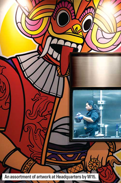
For example, the Sri Lankan food truck and restaurant I did in the UK showcased Sri Lankan traditions and heritage through my yaka mask themed art pieces. This got people from other parts of the world asking what they were and made them interested in learning more about our culture, which is one of the things I want my art to do – tell a story.
Q: Your recent work has been on commercial projects such as restaurants and offices. What are the challenges you face when designing for different client briefs and user groups?
A: Creating art for architecture and interior projects with a set brief can be both easy and quite challenging, in terms of limitations and creative freedom. Usually, I like having the creative freedom to come up with the concept and process by myself.
Working on art for projects like this also includes having to coordinate with the clients’ and consultants’ requirements and limitations. But since I’m an architect, I think it gives me an advantage and makes it easier for me to collaborate with the clients and project consultants in understanding and visualising what works best for the project as well.
The other challenges are the time frames. For office projects, the timelines are usually more crucial as opposed to restaurant spaces so it’s rather challenging to conceptualise and create art within that limitation.
Another aspect is that the ambiences are also different. For example, you can go a little crazy with the colours and detailing when it comes to a restaurant space depending on the cuisine, context or type of restaurant as opposed to creating art for corporate spaces that require more toned down themes.
Q: Can you tell us a bit about your approach to the recently completed digital murals for WSO2’s new office?
A: I usually start my design approach by studying the company’s history and story, and give it a proposal that justifies and breaks down my concept and vision for the digital murals and what I want my art to portray. So through my proposal, I also communicate to the client the story I intend to tell. This enables them to get an idea of how the artwork ties with their business philosophy as well.
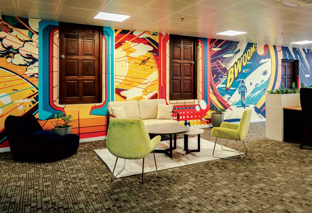
With WSO2, the whole concept was based on it being a tech giant in a universe of technology so it followed an abstract space theme. I had to consider the fact that there were employees working at all times of the day and wanted to inject some fun into the daily grind.
For example, someone working the nightshift would need some added motivation so I felt like this abstract design approach also helps enhance the user experience and mostly helps them enjoy the work environment.
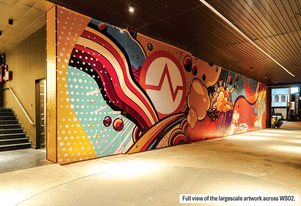
The company initially started with 20 people. So my concept for the main car park entrance area was derived from creating an abstract universe where the WSO2 logo was the main planet and there were 20 other small planets around it. This was to basically capture the company’s founding story and have everyone experience it through the artwork itself.
Meanwhile, the main murals in the internal walls were themed around being inside a spaceship. Most of the offices had views of the city so the artwork on the solid walls was intended to feel like a ‘spaceship window’ to give the employees the feeling of an astronaut exploring and discovering new things.
Q: What are the current requirements of modern workspaces and how do you think art is shaping the quality of corporate life?
A: Nowadays, people misunderstand the purpose of digital murals and art. If there is an empty wall, they feel that adding some sort of mural or artwork will help give the space some life and often tend to do it without any basis.
I really believe that the successful modern workspaces that use digital murals and artwork within their spaces with a purpose can work. And art should also be a medium for interaction, which I believe Sri Lankan workspaces are missing at the moment. It would be really cool to have interactive pieces that could help employees destress during breaks and really transform common spaces.
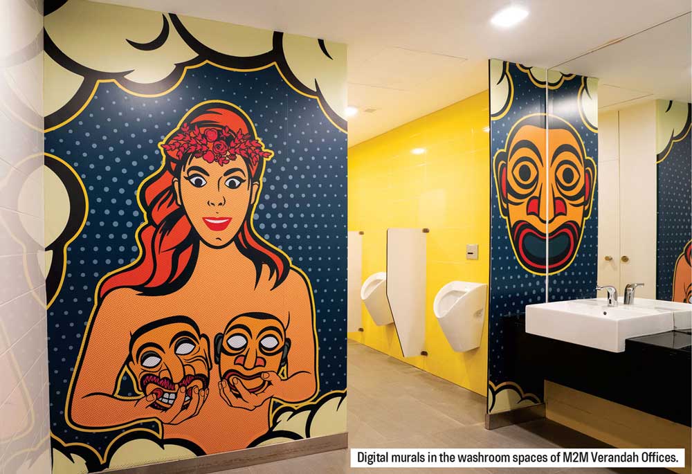
One of the projects I enjoyed working on the most was the commissioned artwork series I did for the M2M Veranda office complex designed by MVRDV. That project took an unconventional approach in including themed artwork in the toilets, which is a space most people don’t pay attention to.
Artwork doesn’t always need to tell the story of the company or building. It can be something that engages you and increases your curiosity or even a conversation starter – something to talk about. Modern workspaces are slowly becoming a little more intentional with the way they want the space to speak to the user, which is a positive approach.
Q: Your most recent commission was for the newly opened restaurant Headquarters by W15. How do you find creating art for restaurant interiors as opposed to commercial office spaces?
A: I definitely enjoy doing restaurants more because you have the freedom to do something that is much more vibrant and fun. I’ve created art for a few restaurants so far and I find it more liberating comparatively.
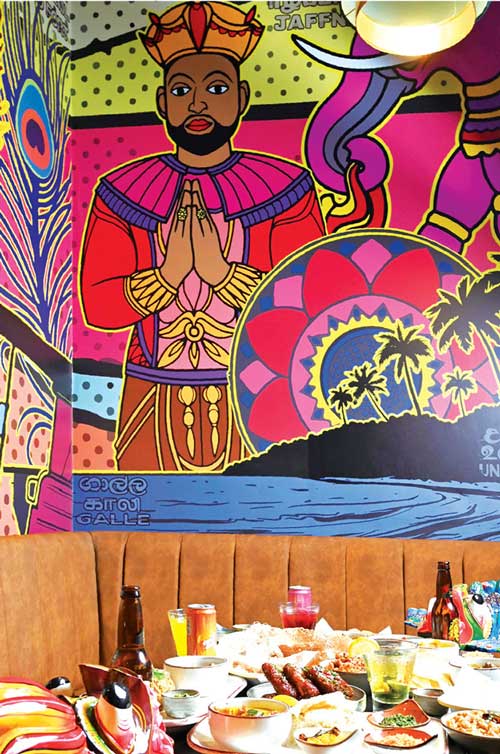
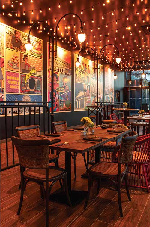
With the Headquarters by W15 project, I drew inspiration from the surrounding context itself. My intention was to tell the story of the vibrant heritage, character and language of Colombo as it used to be in the past and bridge that to the city it is becoming now.
I basically used my knowledge of the context and zoned out the spaces within the restaurant according to the themes I wanted to use.
For example, the main restaurant space frames the view of the Lotus Tower and developing city fabric. So on the opposite wall, I wanted to capture the character of the ground level with scenes of the food carts, the social fabric within the fort area, the colonial building facades and bustling sights in the format of a storyboard strip, so it gives the user an essence of the city’s roots and to basically have them travel through time.
And for the bar area, I drew inspiration from old labels and classic dance scenes to complement the atmosphere and take the user back in time as well.
What’s interesting is that after my draft proposal was given, it inspired the client’s marketing strategy for the restaurant as well, which was quite fulfilling for me personally.
Q: What is your vision and aspiration for the art you want to create in the future?
A: I believe storytelling is important when it comes to interiors and spaces.
Art can be perceived in many ways. Sometimes, the story the artist wants to tell is not always how the user may perceive it. So the power of interactive art can bring people together.
I also believe that to grow as a digital artist, it’s important to collaborate with designers in other creative fields to create outreach for your artistic philosophy and brand as well.
I definitely want to explore the idea of three-dimensional pieces. As I said, the ability for a person to interact with the art itself is something I would like to achieve.
Moreover, I believe that engaging the user directly in the artistic experience can enhance not only interior spaces but even outdoor public spaces. Personally, I would want to continue to inspire people around the world through my art, and educate them on our heritage and culture as well.
PHOTOGRAPHY Architect Ramitha Watareka

